Save All Dogs Animal Rescue
Social Media Redesign
The Challenge
Save All Dogs Animal Rescue is a 501C3 nonprofit organization who pull unwanted animals from kill shelters and unwanted homes.
For this project, our group of four needed to do a full redesign of their social media channels, this included an audit of their current posts and designs, research on competitors and audience, and creation of Facebook, Instagram, Email, and Motion content.
Background
Our first main task was to evaluate the current communication channels utilized by Save All Dogs Rescue. From this we found that they most often used their Facebook, Instagram and website to convey info on new dogs, business activities, and any events that they run. From their channels, one of the main problems we found is just a very outdated design system, with scripty text and poor layouts, it made it unnecessarily difficult to connect these animals to their potential owners.
Current Designs and Channels
Competitor Analysis
One of the core parts of any redesign is getting an idea of what competitors are doing in the space. For this, we looked towards other animal shelters in the area to see what was working and what wasn’t.
One of the first organizations we looked at was the The Humane Society of the United States. Not only did it have great branding and direction, but it was fairly consistent across all their channels and mediums.
They were also very active across all of their platforms, whether it was on their site, on Instagram, or Facebook, they usually post at least daily.
Lastly, we found that they had an ephasis on videos and motion graphics, using Instagram/Facebook reels while also uploading short and long videos to their website and social media accounts. These often saw more engagement than traditional images or posts.
What are we going to make?
After completing a thorough competitor analysis, we were now able to decide exactly what we wanted to include in our redesign. We knew that Facebook and Instagram both needed a facelift, along with trying to add more motion graphics and videos to their pages. We also wanted to expand as well into email blasts and newsletters so that potential owners can always get direct updates straight to their inboxes. Then, we want to create mockups for both Facebook and Instagram to display what an updated design system can look like.
Concept
With an idea of what we wanted to make in stone, I wanted to make a concept art piece that could provide direction for the rest of the group. While the first sketch was rough, it gave me enough to make a more polished version that we could use as a reference for the next series of projects.
Color Studies
Concepts down, it was time to nail down the brand board as much as possible. We started with the colors. We bounced around on deciding what colors would look best and never felt like we could come to a consensus. So we wanted to try and explore what it would be like to have a more fluid color palette. Using this idea, we came up with a rough idea of core colors that we could reference, while allowing for fluidity based on the design.
Type Studies
Typography is essential for any business, and having a strong typeface that can define your brand can help draw in new potential customers or adopters. For this project, we settled on Degular and Avenir. While Degular provides that fun bouncy kind of look, Avenir provides that sharp and straight contrast that works well together overall. This pair ends with some great results that you’ll see below.
My Contributions
Logo Design
One of the first aspects I needed to redesign was the logo. Clearly made in a Word or PowerPoint document, it wouldn’t be enough to grab people and make them think it is a real, reputable shelter. I wanted to make sure it followed the guidelines and colors that we set before, while still feeling unique enough to be from an actual business. I settled on using both Degular and Avenir to give a separation between the two aspects of the logo, and using pure white and black so that the logo can work in almost any situation.
Motion Design
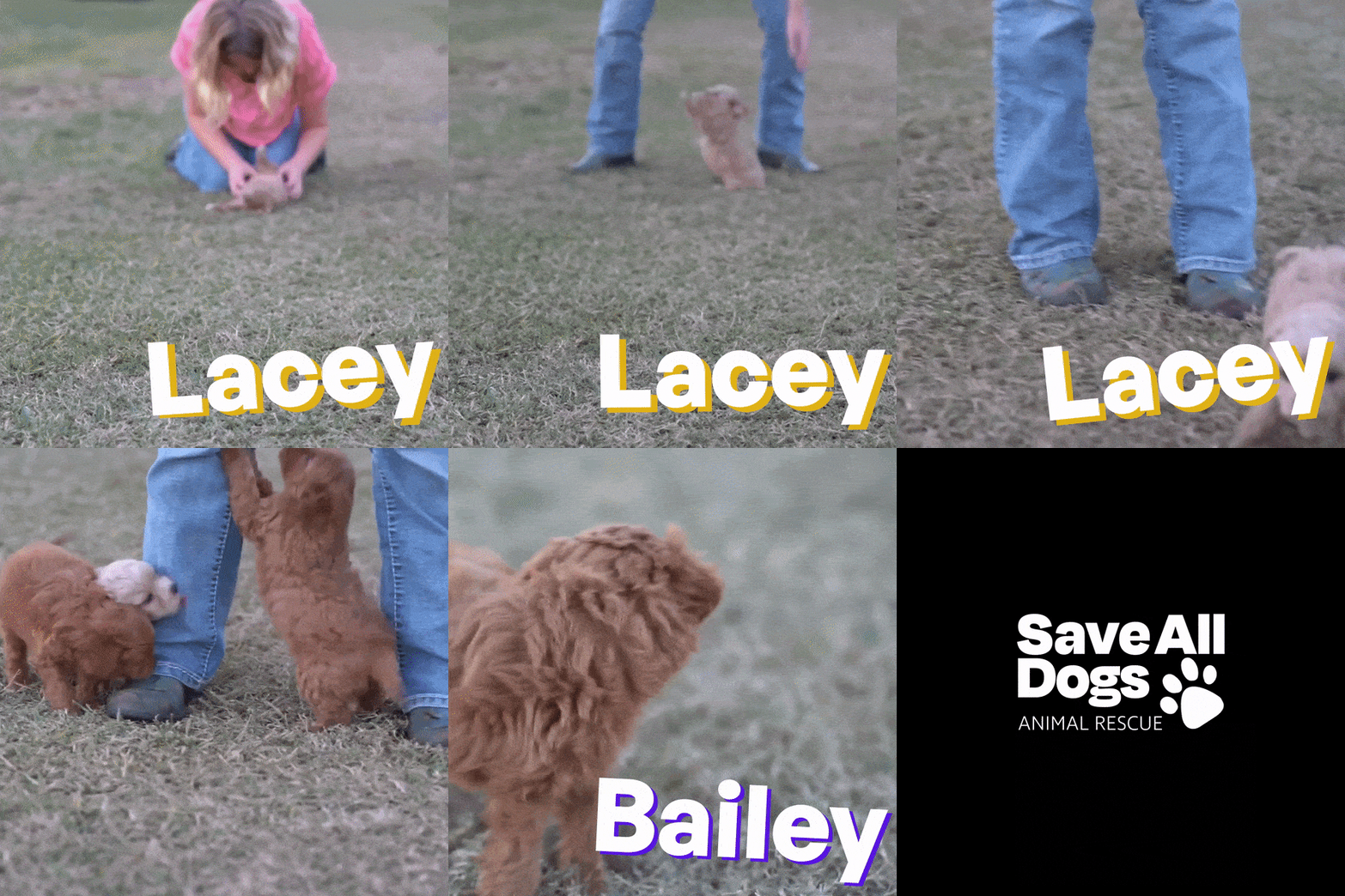
Motion graphics are an essential way now for businesses and individuals to communicate with the world. It has become harder and harder over time to capture viewers’ attention, and using motion and video helps grab a viewer’s eye and show them what is happening. In many ways, motion also provides the most information without making people read a paragraph of static text. The same can be said with videos, it is one of the main reasons that platforms like TikTok have garnered so much popularity in recent years. For this project, I wanted to make something simple enough that it could easily flow through someone’s feed on Instagram or Twitter, but still stand out enough that they would take a second to look further into the page or see our site after.
Group Contributions
Instagram is one of the most unique platforms as it offers almost endless options for photos and videos, evolving far past its initial inception of just a way of sharing pictures.
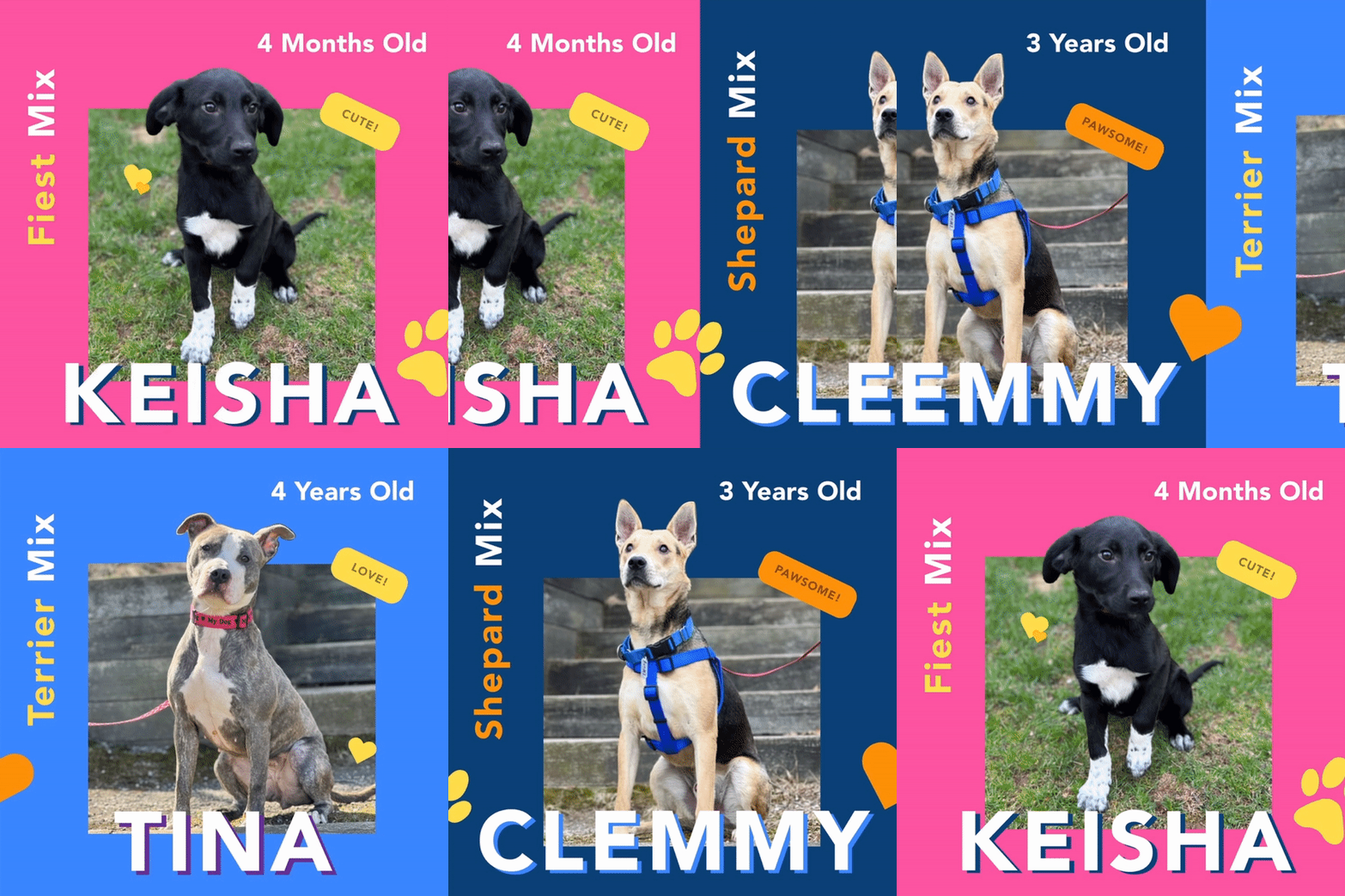
Though with this, means that businesses need to vary the kind of content that they post to the platform. Because of this, we tried to vary our posts, creating images that center more on the dogs themselves, while also having content that emphasizes events or other aspects as well, such as National Rescue a Dog Day.
Overall, the end product came out really great, and it shows how versatile Instagram can be for promoting a business or event.
Email Blast and Newsletters
Emails have also become a core part of daily business and work, often being one of the main ways that businesses maintain connections with patrons and customers.
For our emails, we wanted to emphasize the dogs themselves, and cut down on text as much as possible. Overall, they came out pretty good, there are always going to be some layout issues and more, but the start is there and ready to be built upon.
As one, if not the, biggest platforms in the world, Facebook is one of the sites you just need to post on. Not only is it the social media site of choice for advertisers, but it is often where you are going to find many of the core demographics that want to buy a dog.
For this, we wanted to not only feel like we are targeting older, 30-50 year old users who might be looking for a long time friend, but also some experimental aspects that younger viewers might connect with. From this came a variety of posters, to banners, and reels, all looking at what would bring someone in to the shelter.
Mockups and Reflection
I am super proud of how this project came out. It is always difficult to work with designers who all have vastly different ideas, skillsets, and methods so being able to bring everyone together and have some pretty great final products was so amazing to see.
This experience has also helped me know how to better manage a team, especially in this capacity. While I know there are a million and one things I could have done better, I tried staying open and honest as much as possible.
I can’t wait to look back at this project and see this as a first jumping-off point, and a period that helped kickstart my future.


