App Architecture: Clinton, CT
There’s so much that goes into apps today.
From extensive research on what users connect with to icons that work best to color palettes that click the most, creating an app is difficult.
But, one of the most important aspect is having a clear and concise architecture. For users, this means ensuring that they are able to reach the aspects they need most, as quickly and easily as possible.
But while many people feel they can directly transition their websites to an app, it might be better to change direction a bit.
Let’s first think of an app we like to use, like Instagram, or YouTube. Both have excellent use of their bottom navigations so that moving around feels simple and easy.
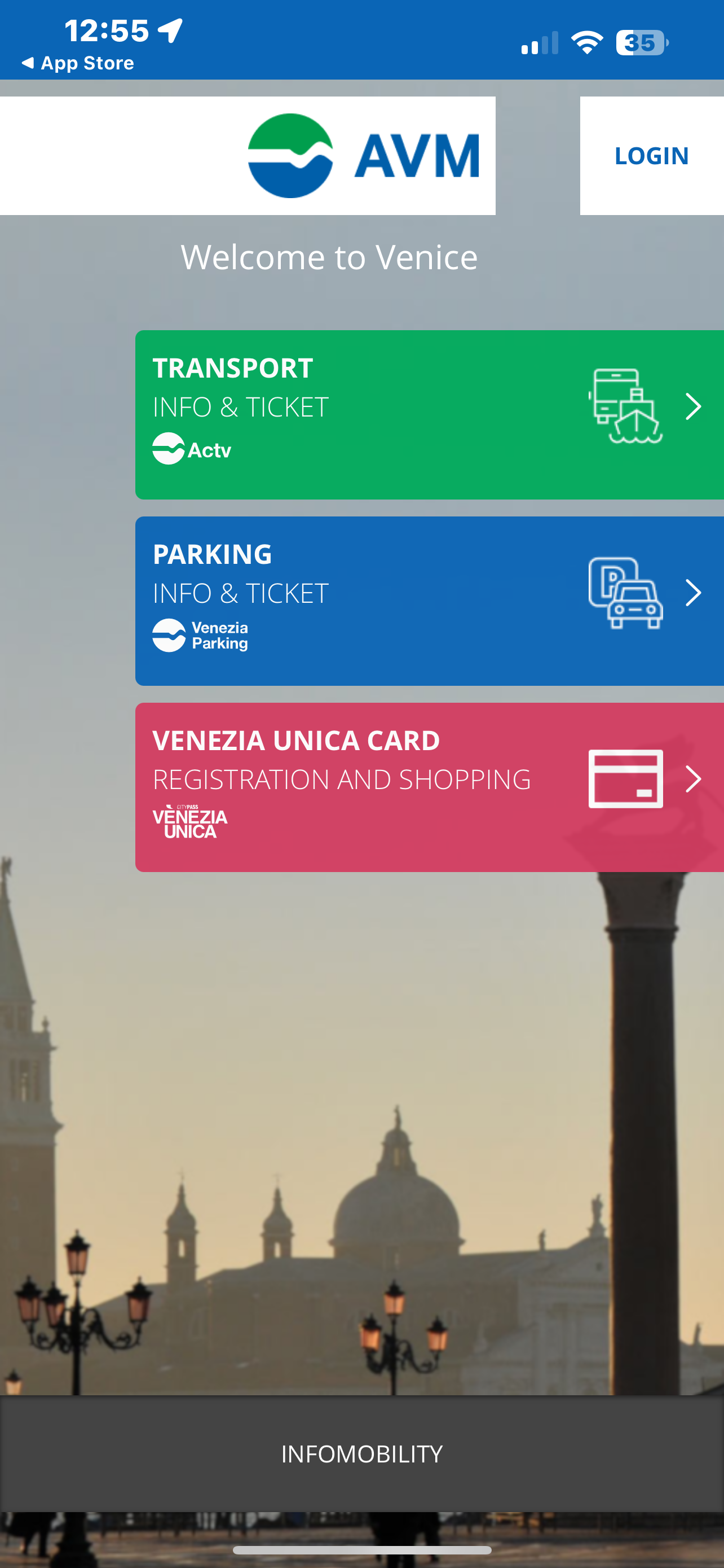
Now, lets imagine a poorly created app. Can’t think of one? Don’t worry, lets quickly walk through an app I had to try to use when in Venice recently.
The app is called AVM Venezia, a mobile way to book water bus tickets and see timetables.
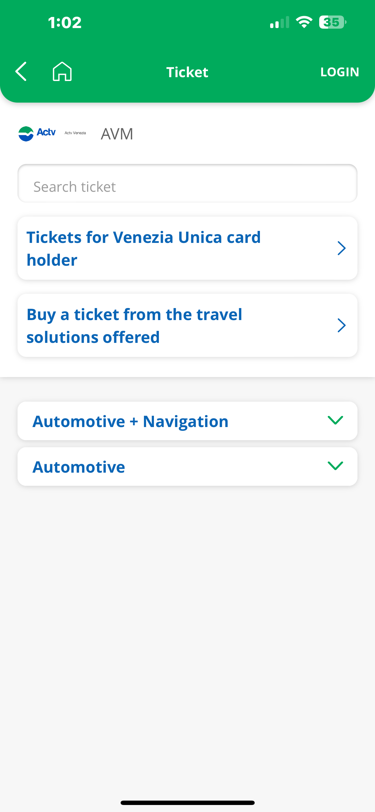
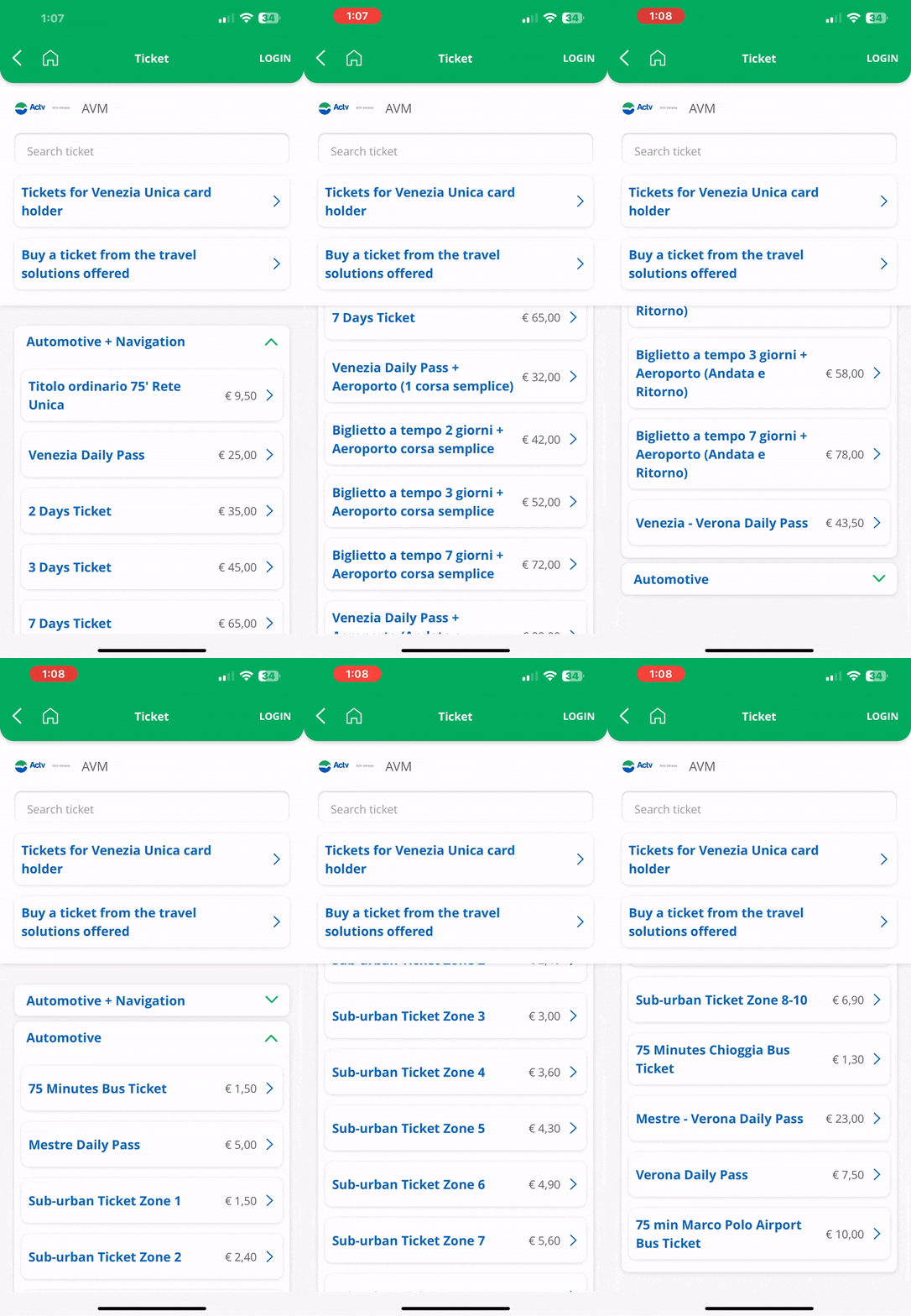
This app is poor in so many ways, first being that trying to book the correct bus ticket feels almost impossible for a tourist like me, as we are thrown into the screens below without knowing at all what we need to buy.
Out of all the tickets shown in the video above, which ticket do you think you need to buy?
If you answered “Titolo ordinario 75' Rete Unica” you are correct! This is the ticket most people should buy when purchasing a water bus ticket.
Apps like these show why good navigation and explanation are so important. So, in order to create an effective app for a town or municipality, we need to ensure it's as simple and straightforward as possible so that people can get where they need to go.
App Architecture
For this, we’re going to be creating a app architecture for Clinton, CT, alongside the information architecture for their website discussed in this blog post.
Let’s start by looking at our website proposal, which we discussed before.
While this structure works well for web, the transition to app isn’t great. Even this structure still has way too many options that aren’t really necessary for a companion app.
What we need to be thinking is who do we expect to actually use this companion app. For web we needed to cover broad strokes, residents, businesses, or just about anyone who might stumble onto the site.
For the app we’re narrowing down our scope to essentially exclusively residents or business owners.
So, if its just about people currently living in the town, why do we need to provide so much general information that the common user isn’t even going to use?
Because of that, we’re going to cut down everything, and highlight the aspects residents and business owners need the most. With that came this proposed app architecture:
Right from the start, we can tell how much this navigation has changed. Instead of focusing on the different types of people, we consolidate aspects into services, explore, and more, with a dedicated search now added along with a pinned section.
This change was made to prioritize crucial items people need, like police and fire information in case of an emergency, payment portals to pay town taxes, links to employment records and permits, and a way to report an issue within the town.
Then, most government, business, and resident information were consolidated into the explore tab, giving users the option to find out more about the town or go to a department’s individual page.
Lastly, more options were added to give users a way to sign in and view their profile, as well as view contact information and other extraneous information they need. This is combined with search to immediately find something they need and a pinned tab to pin individual departments or boards to quickly refer to them or any other page the user finds important.
The goal here is that more residents opt to use the app instead of the website out of convenience, and the only way to achieve that is through some major change.
Overall, the app architecture turned out great and shows too the thought that developers and designers need to give in order to provide a useful experience to users.
To see the full project, click here or scroll down below!


