Information Architecture: Clinton, CT
Cities aren’t ever known for their website.
There might be a few good ones out there, like LA County’s website, which launched a few years ago, and New York City’s site, which, while not very aesthetically pleasing, does the job very well.
So, what makes a site work?
Well, it all boils down to the overarching information architecture.
Information architecture, as described by HubSpot, “is the practice of structuring and presenting the parts of something — whether that’s a website, mobile app, blog post, book, or brick-and-mortar store — to users so that it’s easy to understand.”
And in theory, that seems easy enough. Just put all the things users want in an easy-to-access place, and BAM! It’s done.
Well at least that’s what most towns believe, as often scrolling through municipalities site’s, we are overwhelmed by navigations with massive lists of different boards, departments, services and more.
Clinton, CT’s Homepage Navigation
This is not helpful for the user.
What we need to provide is not just a jumbled list of every single thing anyone might want information about; it’s a simple way for people to find what they might be looking for.
Now, with an idea in mind, let’s see how we can improve this.
Making a Hierarchy
First, we want to map out our current site. For this, I will work with Clinton, CT’s page, located at clintonct.org.
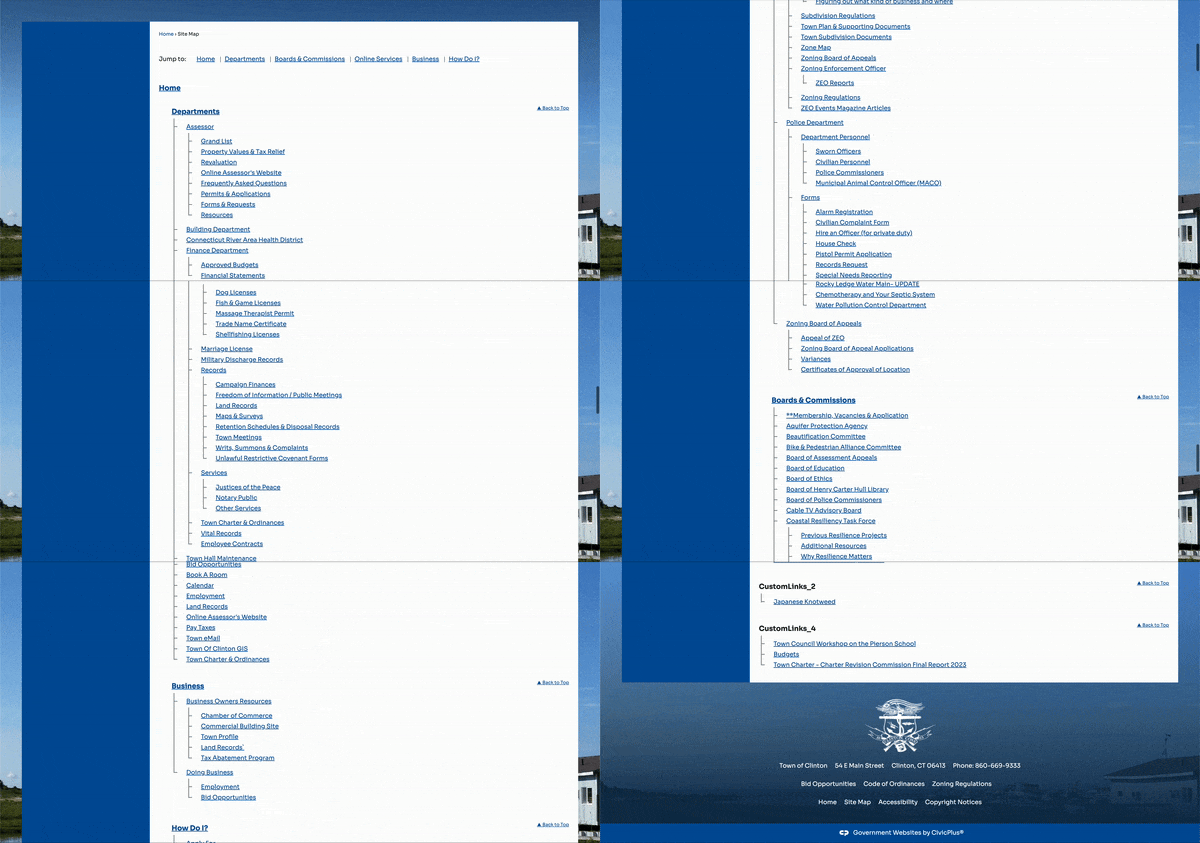
When starting, using a resource like a sitemap often helps, as it can easily lay out most of the pages, subpages, and more, making it easy to understand the overall hierarchy of the site.
Luckily, Clinton has a sitemap setup, so we can use that as a reference for creating our IA.
Now, let’s get building.
I’m going to be using draw.io for this project, but any flowchart tool can work for this.
I then start from the broadest item to the most specific, starting with the homepage at the top and working my way down through the different sections laid out in the sitemap until I add subpages within those.
I then go through and map out the auxiliary items as well, like the site's footer and (for this one specifically) the bottom screen navigation.
Then, we just need to create a legend to identify the items we put down, and we have a completed IA!
Clinton, CT’s current site architecture.
With this completed we can really start seeing the issues with this site. It’s initially overloads the user with tons of information about the departments and boards, then feels like it hides everything else in the Online Services and How do I tabs.
What we need to do is refocus this, and understand who is exactly the people accessing this site, and what are they looking for.
First, we need to ensure we are catering to our residents, as they are a majority of the people coming to this site, trying to find information about local services. Then, we need to ensure business owners as well are serviced and know how to manage a business within the town.
With these two audiences, let’s reevaluate this hierarchy.
We’re going to make four main pages: Residents, Government, Business, and lastly, How do I.
These ensure we encompass our core audiences while also keeping all the town information that was present before just under a singular nav item.
We then can easily clean up the footer by using our four pages as the four quick links.
With all of these together we get this proposed information architecture:
By giving each section its own categories within it, users now can quickly look for what kind of service or information they need, and get to their desired location quicker.
Similarly, we can use this to simplify the government information that was bombarding us before by just providing the first most popular boards and departments and leaving the rest under the view all button so those looking for the others can still easily reach them.
Lastly, the How do I will continue to serve as a quick links area for those trying to quickly find how to pay taxes, find information, or submit forms, as well as a search feature so that users can easily type in what they want to do and be directed there.
This aims to improve the user's experience on the site and ensure that people who aren’t able to navigate websites easily can still get where they need to go and receive the services provided by the town.
To see the full project, click here or scroll down below!
Fitzgerald, A. (2022, September 13). What is Information Architecture & Why does it matter?. HubSpot Blog. https://blog.hubspot.com/website/information-architecture#what-information-architecture


