Clinton, CT - Creating User Flows
When making an app, there are so many factors you need to consider.
From what functions to add to how it looks, each requires a careful decision. And one of the hardest aspects to factor in is what the user will do.
That’s why we create user flows.
What is a User Flow?
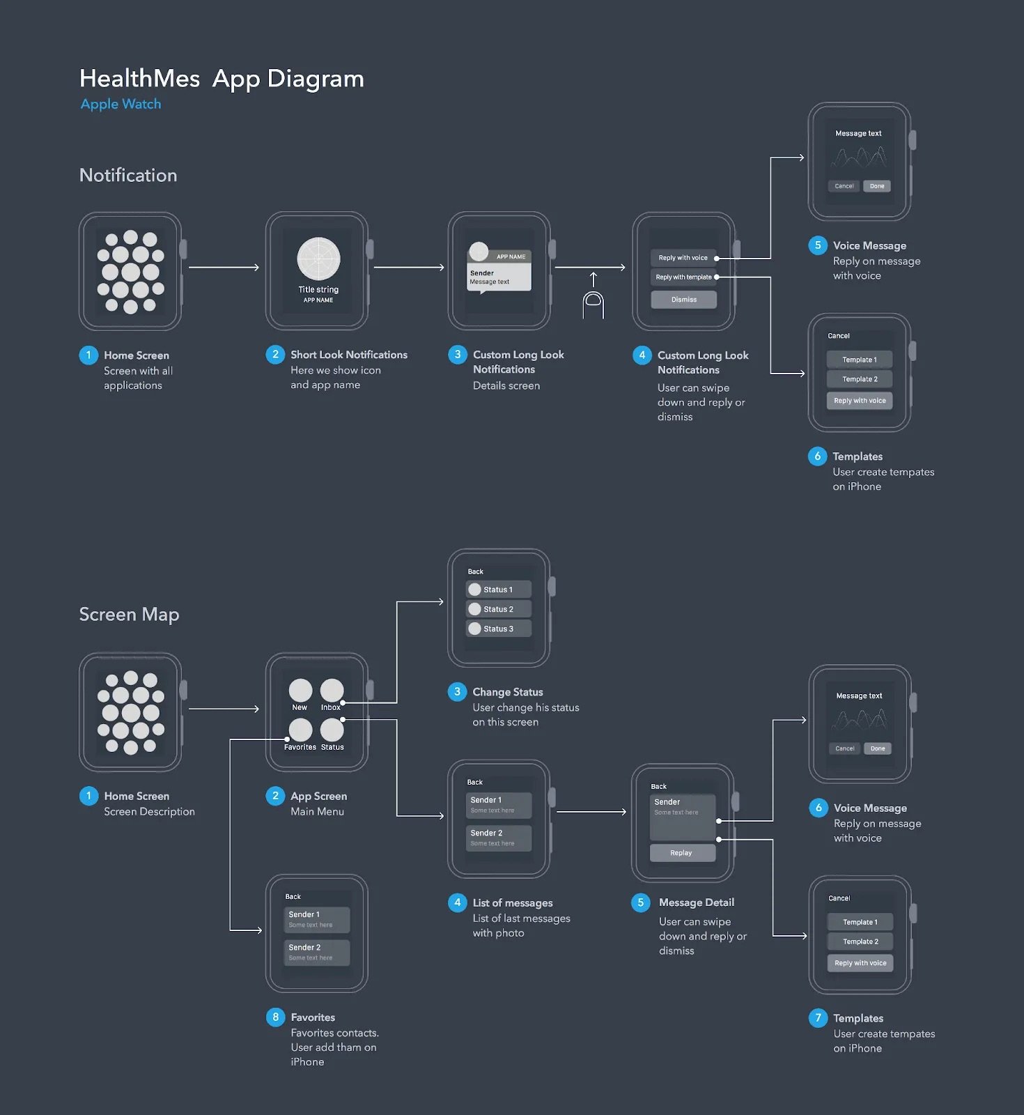
A user flow takes information gathered about what you want users to do, then “…depict[s] the path a user can take to complete a task while interacting with a product. A user flow focuses on the user's needs and the most efficient way to meet them.”
In many ways, it is trying to understand how users will solve a problem through the paths you create.
A diagram showing the user flow for a Apple Watch App. Via Interaction Design Foundation
Thus, working with user flow helps us understand more about the user’s journey, how they will get from page to page, and whether there is a way to simplify the journey for them.
Setting a Story
Ok, with an idea of how user flows work, we now need to set a story. A story is usually just the catalyst we base a user flow on, such as saying, “As a user, I want to be able to like a friend’s post and see the post in my liked tab.”
From here, we would then make the journey the user would go on to achieve this goal.
Let’s take a look at an example from the My Clinton Companion app I’ve been working on over the past few weeks. Here one example story would be “As a long-time resident, I want to be able to submit a broken traffic light to the town so that it can be quickly repaired and town residents stay safe. “
Creating a Flow
With a story set, its now time to start creating the user flow. For this, we need to keep in mind the Information Architecture we’ve created before so we know where users can go and what they will be clicking on.
Now, with the story of “As a long-time resident, I want to be able to submit a broken traffic light to the town so that it can be quickly repaired and town residents stay safe,” we can evaluate how a user will flow through this journey.
First, we expect the user to go through the “Services” tab, then into “Report an Issue,” but then, we run into our first decision point, as users can search for an issue specifically, or can choose from a category page as well.
They then both come back together when the user selects an issue, which then prompts them to add information, followed by a prompt to log in to their account, where the user can either log in in or submit as a guest, just adding some basic contact info so crews can verify location and information.
And that’s the main process! Being able to easily and efficiently describe the journey your user takes is essential to laying out what screens will look like and how you get from one place to another.
To see more, check out the full report here or by scrolling down below!


