What Makes a Good Chart
As technology has progressed over the years, data visualization has become better and easier to use for the masses, with programs like Microsoft’s Excel and business software like Tableau being offered to help companies and everyday people make more informed choices, based off of their data.
Some of the biggest advantages with these advances in data visualization is that we can now have charts and graphs made faster or even automatically based on a set of data. One of my favorite parts at my job now is that we can have live data from our site be turned into heat charts to show what is working and what is not based on what people are clicking on.
Similarly Heavy.AI talks about how data visualization can be used in conjunction with the emergence of new tech like Machine Learning and AI, saying:
“Data visualization can better depict and explain algorithms common in machine learning — such as the decision tree and the neural network. This allows users to see a neural network in action in ways that a written or verbal description could never capture.
Machine learning is considered hyper-intensive programming, which can be difficult to execute and comprehend. Data viz helps the human eye and mind better appreciate and fathom how a machine learning algorithm works.”
Even though there are some great advantages to these advances in data visualization, there are still problems that can occur.
One of the most major that can happen through any form of data visualization is misinterpreting data. Ofter when we try to simplify data into these charts or diagrams, we end up loosing some of the minute details that may influence a larger descision.
In business situations, these decisions can greatly change the way the company is run, and can cause serious problems if the visualization wasn’t telling the whole story.
Tableau comes to the same conclusion on their blog, saying:
“Sometimes a visual medium can lead to confusion in the viewer, so different people in your audience may walk away with drastically different conclusions after viewing the same viz.”
Another problem with the advances in visualization is that often we are more unable to find inconsistencies or errors in data, as we become so quick to translate these to pretty charts and graphs that everyone can look at. It is essential to make sure that these data analysts are able to investigate the data to ensure there are no inaccuracies before presenting to higher-ups or other teams that may basse a strategy around the data.
For me a good chart is really anything that can improve my work. So, I tend to love heat maps as its able to translate direct data into a visual that I can directly see and understand where people are clicking and try to piece together why. I think that basically any chart though can be a good chart, it just needs to be accurate and fitting for that situation. Even though the heat maps and charts for our website are best for that situation, a simple bar graph is great for just understanding metrics within a period of time, like revenue generated.
Even though I may not use them, I know some of my favorite charts are any that overlay data in an unconventional way, such as these from the New York Times.
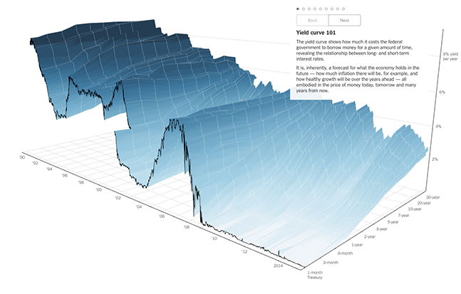
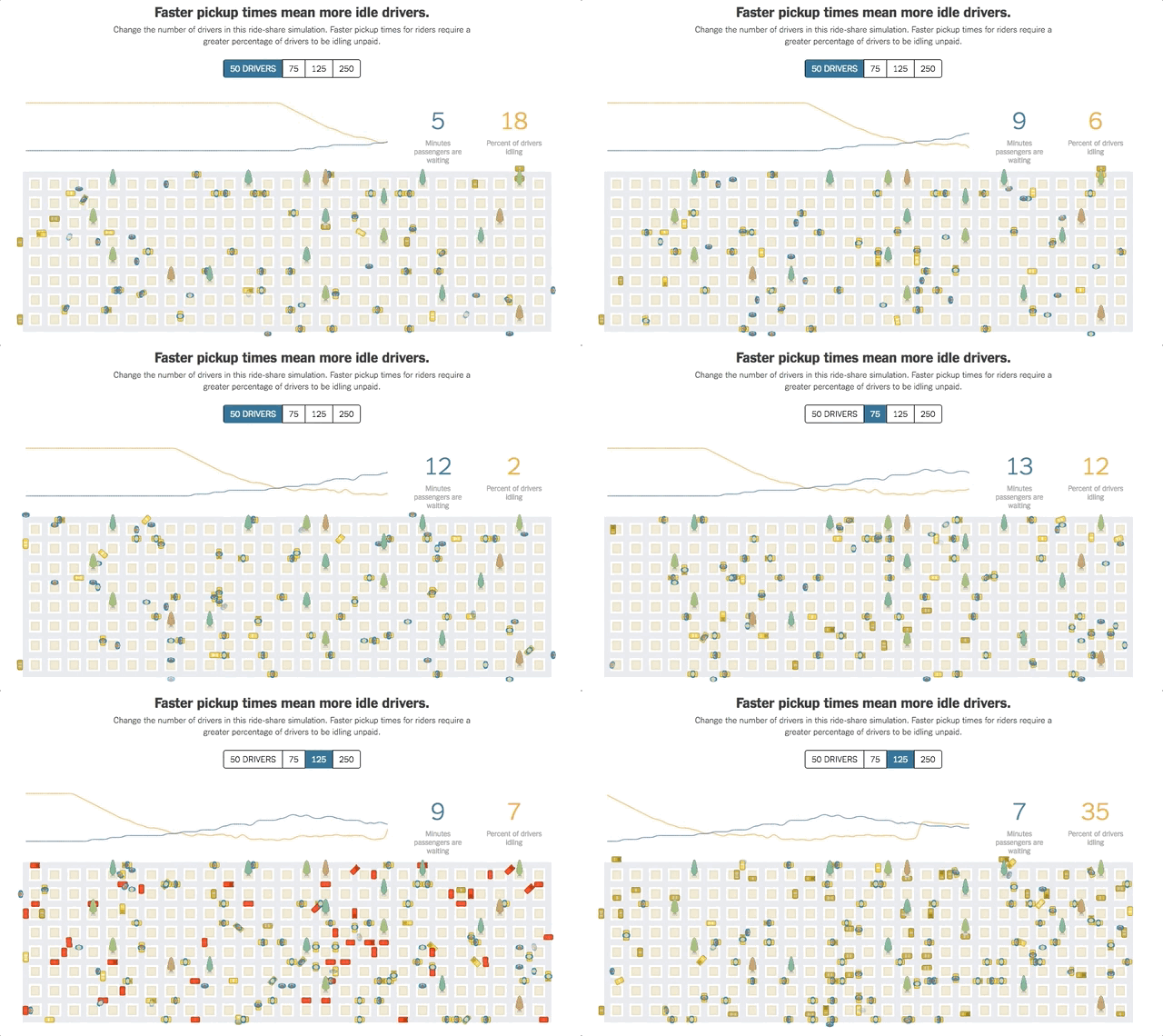
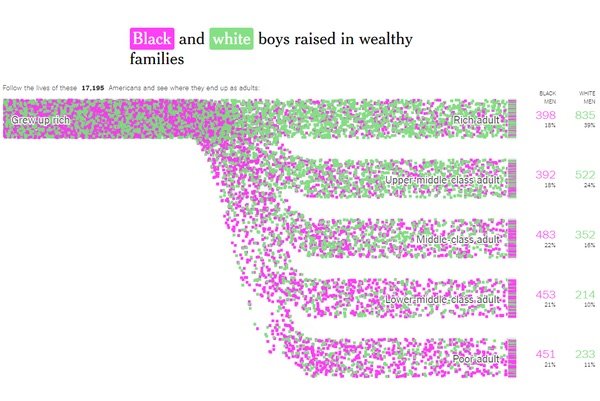
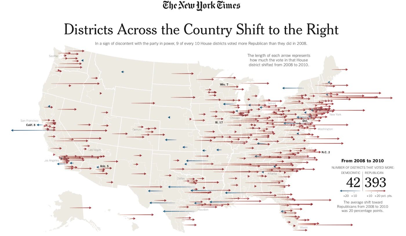
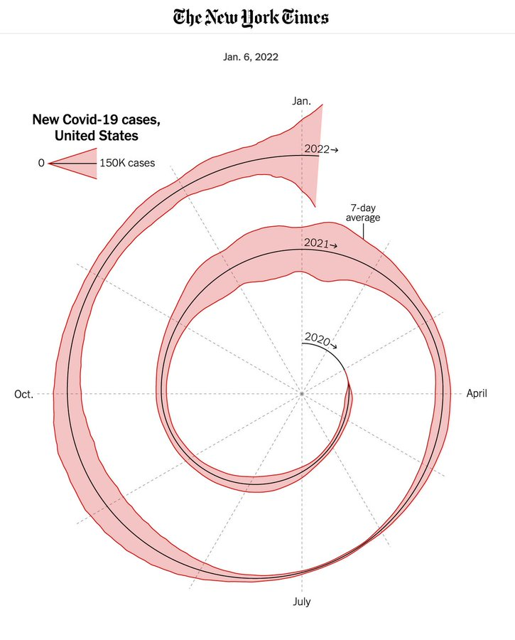
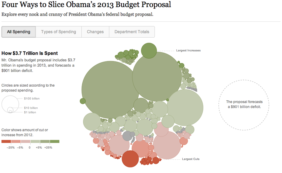
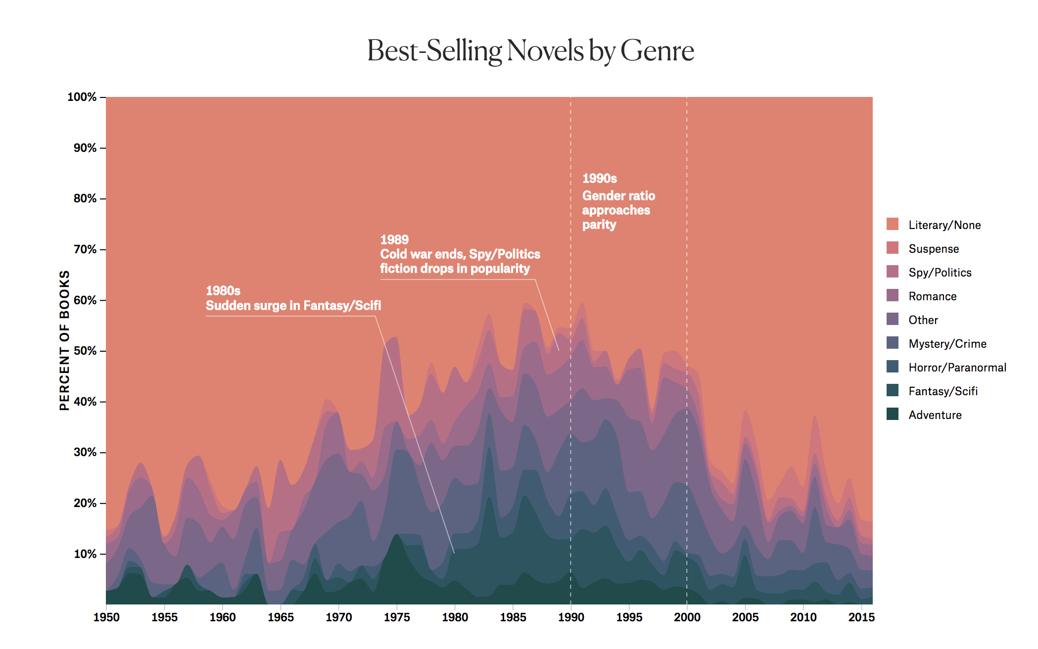
This kind of data is so interesting as it shows the ways that data visualization can be used to be understood by the masses. Not everyone is going to be an expert on rideshare statistics or current socioeconomic politics, but a good graph can give people a grasp on what is going on. That is what I think is so special about data visualization, and why we need it so much now in our current day.
Data Visualization - a complete introduction. HEAVY.AI. (n.d.). https://www.heavy.ai/learn/data-visualization#:~:text=Data%20visualization%20is%20a%20graphical,detail%20and%20create%20new%20insights.
Tableau Staff. (n.d.). What are the advantages and disadvantages of data visualization?. Tableau. https://www.tableau.com/data-insights/data-visualization/advantages-disadvantages

