Using Visual Numbers
Data constantly surrounds our lives. From the clothes we wear to the places we visit, there is information being gathered that tells us more about what people do and how people act.
However, without anyway of presenting this information, it is just a collection of numbers. That is where data visualization comes in, it is “the art of representing data in a way that it is easy to understand and to manipulate” (Interaction Design Foundation 2020).
By taking this data and converting it to something like a graph, chart, or table, we can start to make better sense of the numbers and reveal trends that were previously hidden before.
Counties that traveled the most during COVID-19 Lockdowns Image via The New York Times
Another method of this is using visual numbers, or real life infographics, essentially representing data using real items.
Most people have seen this type of visualization before, as it gives substance to the data you see, grounded in the objects that represent the data.
These end in more meaningful visualizations that often are used to inspire change.

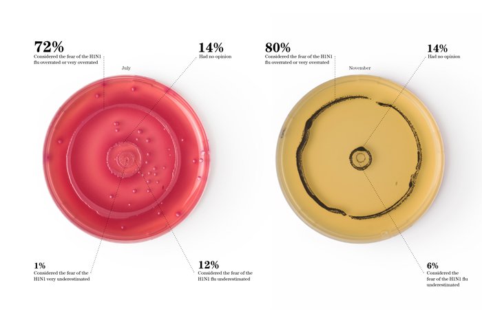
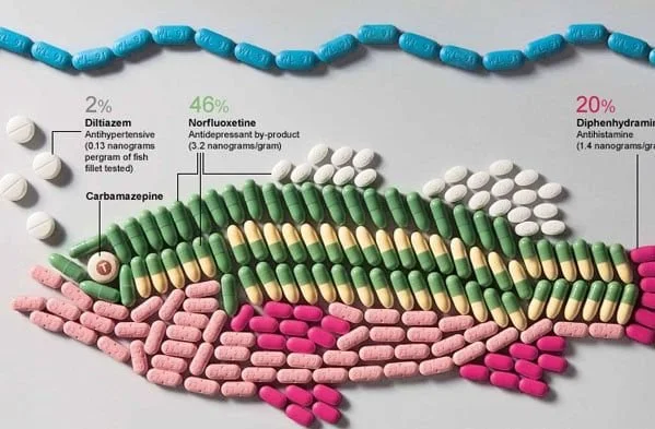

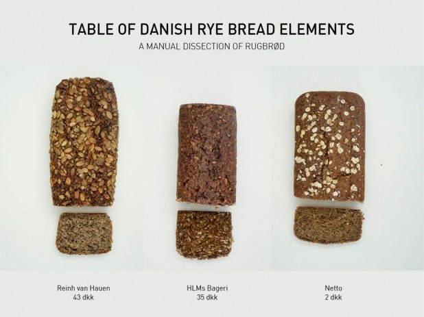
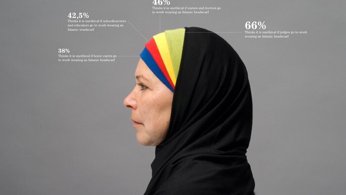
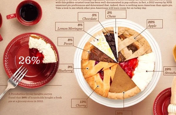
These images are some of my absolute favorite examples of data visualization, so I wanted to try my hand at creating my own.
I first needed to find some data to represent. I decided to explore shoe brands as I find that most people have strong allegiances towards sneaker brands, and it would be interesting to see how this breaks down into market share.
Luckily, Statista had created a small infographic on brand market share based on sales.
Felix Richter via Statista
With this as a starting point, I went to work creating my real-life infographic.
I knew that shoes needed to be the center point, so I started gathering images of shoes from these most popular brands, looking mainly for their best sellers if possible.
I then began laying them out, making the largest brand the biggest in the infographic, then scaling the next brand down proportionately to their overall difference in sales. This then created a clear scale between each brand.
With this base established, I then just needed to add more context, adding a key above each that denoted the overall sales each brand generated in 2022, then adding a title and subheadline that explains exactly what is happening.
With this, my final infographic is complete!
This is a really fun way to create data visualizations, especially if it is something you are passionate about, as it is able to emphasize the subject in a way not many other graphics can.
If your planning to do a data visualization in the future, try using real life infographics like these!
Interaction Design Foundation - IxDF. (2020, July 3). Information Visualization – A Brief Introduction. Interaction Design Foundation - IxDF. https://www.interaction-design.org/literature/article/information-visualization-a-brief-introduction
Richter, F. (April 14, 2023). Ahead of the Game: Nike Rules the Sneaker World [Digital image]. Retrieved November 12, 2023, from https://www.statista.com/chart/13470/athletic-footwear-sales/
Sinar, E. (2016, February 15). 7 data visualization types you should be using more (and how to start). Medium. https://medium.com/@EvanSinar/7-data-visualization-types-you-should-be-using-more-and-how-to-start-4015b5d4adf2


