Photojournalism
For my photojournalism project, I aimed to capture the essence of winter in the northeast, focusing on the changing season, and the feelings and emotions that most people go through during this time of year.
Right from the start I knew that I wanted to capture the reason why winter always feels like such a downtime of the year, as most people feel less inspired, tired, and often a lack of motivation throughout the winter. This is called seasonal affective disorder and is a type of depression.
I wanted to be able to call this type of feeling out visually and explain to people why the Northeast just doesn’t feel the same in the winter.
The Process
When writing and capturing for this project, one of the aspects I wanted to cover was the four principles of visual storytelling, which are authenticity, sensory, relevancy, and archetype (Montalto 2022).
Throughout the process, I tried to ensure I was hitting each aspect, being true to what I felt as a person living in New England and experiencing winter every year, while also connecting it to why people feel this way.
With this mindset, I was able to go out and start capturing photos, focusing on what makes this year so bleak in my mind, while also using aspects of Gestalt Principles to try and create better images with symmetry, simplicity, and continuity.
This created an amazing result, but they were still far from perfect, which is why some editing was needed.
Editing
I found the editing to be one of the most important parts of this project, as the base images themselves had the content I was looking for, but the editing would be the one to add the meaning. For this, it included color correcting, cropping, touching up, and more.
Each image needed to be able to stand on its own, be impactful, and also visually pleasing.
I heavily utilized Plutchik’s wheel of emotions for this, using color correction to add orange as an interest for viewers, but also blues and purples to drive home the idea of sadness and melancholy that comes along with the winter in the northeast (Interaction Design Foundation 2021).
Even this however, I was still not happy with the end result, which is why I looked towards Nichole Elizabeth DeMeré’s article showcasing visual storytelling examples from major brands, like Slack, PISTON and more, helping me identify exactly what I wanted to focus on and draw audience’s eyes towards.
After all of that was finished, I had my completed images, with just the writing left.
Writing and Layout
I started the page by laying out the images I wanted to see and in what order, as this would help me understand how the story would progress and what I wanted the audience to see first.
I settled on starting with a comparison set of images as I already had an image of Hammonasset from earlier this year when it was packed, then just put it alongside the barren image from today. This would help the audience understand the dynamic I am talking about, and the crux of the story.
I then switched to discussing the lack of people on the shoreline, both relating that politically in some way but also connecting it to nature itself, which leads to images about nature. I feel like these then help develop the idea of how nature craves warmth, and that it goes beyond just us to our environment.
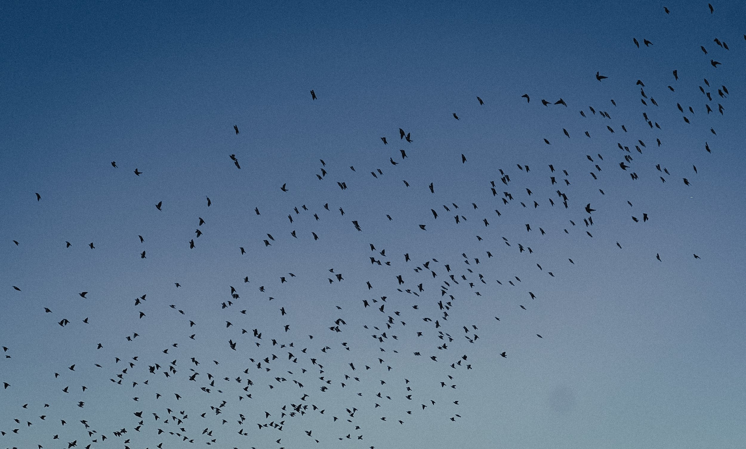
I then wanted to end with the birds flying away, which I feel wraps up the story in a nice way, showing how nature continually tries to run and shield itself from the cold, and we are no different. It’s just life and the world we live in.
Conclusion
Overall, I am proud of how my story came together, I believe it targets something that I have thought of for a long time now, and breaks it down through imagery.
I believe through articles like Ron Reason’s “WED: The Integration of Writing/Editing/Design” and Annie Schugart’s “The Best in Interactive Multimedia Journalism 2017: Pushing the Limits of Storytelling”, I was able to really understand how to implement photojournalism effectively. I would love to continue trying techniques like this on stories that are even deeper or try to target more divisive issues in America.
For now, however, it stands as a passion project for me that shows off my hometown’s beauty while still conveying a story.
Bonner, C. (2019, March 23). Using gestalt principles for natural interactions. thoughtbot. https://thoughtbot.com/blog/gestalt-principles (Module 2)
Busche, L. (n.d.). Simplicity, symmetry and more: Gestalt theory and the design principles it gave birth to. Canva. https://www.canva.com/learn/gestalt-theory/ (Module 2)
DeMeré, N. E. (2017, July 28). The power of visual storytelling: 15 stunning examples to inspire you. HubSpot Blog. https://blog.hubspot.com/marketing/visual-storytelling-examples (Module 1)
Interaction Design Foundation. (2023, November 20). Putting some emotion into your design – plutchik’s wheel of emotions. The Interaction Design Foundation. https://www.interaction-design.org/literature/article/putting-some-emotion-into-your-design-plutchik-s-wheel-of-emotions (Module 2)
Montalto, M. (2022, May 12). Worth 1,000 words: The Four principles of visual storytelling. amplifi. https://amplifinp.com/blog/4-principles-visual-storytelling/ (Module 1)
NPR. (2019, February 11). These are the standards of our journalism. NPR. https://www.npr.org/ethics (Module 4)
Reason, R. (2002, August 20). Wed: The integration of writing/editing/design. Poynter. https://www.poynter.org/archive/2002/wed-the-integration-of-writingeditingdesign/ (Module 4)
Schugart, A. (2018, January 1). The best in interactive multimedia journalism 2017: Pushing the limits of storytelling. Medium. https://medium.com/@aschugart/the-best-in-interactive-multimedia-journalism-2017-pushing-the-limits-of-storytelling-e2ccdec8e576 (Module 4)
Shurbaji, E. (2014, December 17). Photo narratives. Medium. https://medium.com/learning-journalism-tech/photo-narratives-d77b812f99dd (Module 4)


