Information Visualization
Within data visualization, there have been a few known methods to creating successful visualization for a wide audience. Scott Berinato of Harvard Business Review, breaks down these ideas into four main categories, contained within a 2x2 grid with the spectrum ranging from conceptual to data-driven on one axis, and declarative to exploratory on the other.
Join as I break down each of the categories and how different visualizations fall into each specific location.
Conceptual-Declarative
Idea illustration, or conceptual declarative images generally rely upon conceptual metaphors in order to explain or demonstrate data, using graphical components like diagrams, organizational charts or decision trees to show structure. These also tend to have more thought put into the design and editing to convey the data.
The following image is a great example of idea illustration, showing a clean and simple graphic, focusing on the journey that customers go through when doing online purchases.
Conceptual-Exploratory
For images under idea generation, or conceptual exploratory, they are expected to also rely on conceptual metaphors like idea illustrations, however, are more centered around informal means of illustration, such as brainstorming or strategy sessions where ideas are scribbled down.
One of the biggest examples of idea generation are mind maps, as they often are a way for people to get ideas down in a quick and easy way, in order to create better, and more thorough idea illustrations later.
Data-Driven-Declarative
In data-driven declarative images, or everyday data-viz, viewers are expected to see very traditional forms of data visualization, such as through bar charts, line graphs, or scatter plots. These are meant to emphasize data through simplistic means, where the data in many ways can just speak for itself.
While there are countless charts that demonstrate our everyday data-viz, charts like this one from the New York Times tend to be my favorite. Here, the Times is using simple line graphs stacked ontop of one another to show how different types of jobs have recovered after the 2008 recession.
Data-Driven-Exploratory
Lastly is data-driven exploratory images, or visual discovery, where visuals are generated through data, but look deeper to explore unique or different ways of presenting ideas that may challenge what we believe. Often in these kinds of graphs, you aren’t sure what is being looked for, rather finding and plotting data to reveal trends within a set.
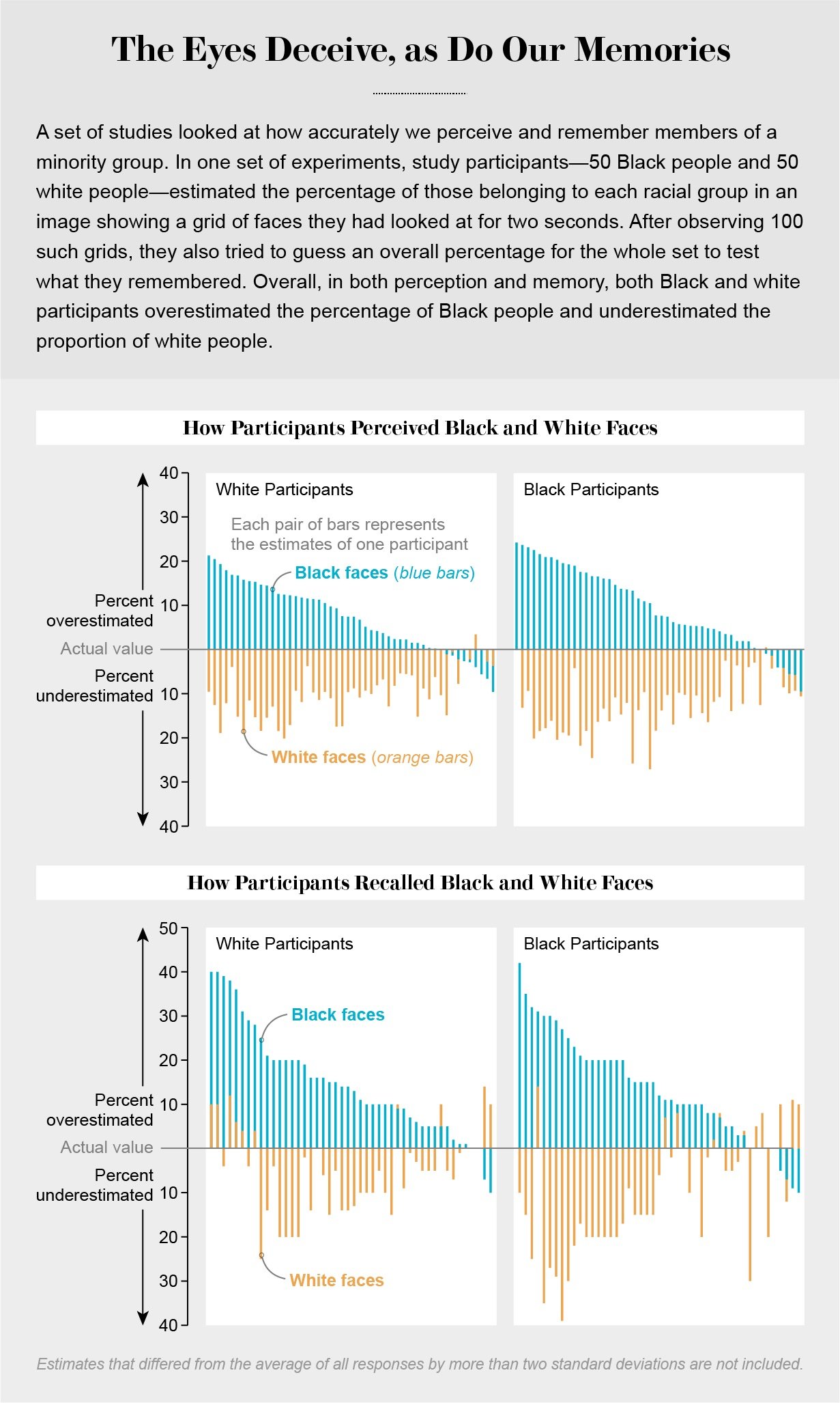
One of my favorite types of visual discovery data is how people percieve reality vs. reality itself. These charts can take many forms, but this one from Scientific American stood out as it takes a study of Black and White Americans to see how they recall and perceive each racial group. These are great examples, as though a single participant or data set itself may not reveal a trend, when plotted together it shows how each group precieves each other, and how much each over or underestimate each other.
Berinato, S. (2016). Good charts. Harvard Business School Publishing Corporation.


