Creating the Prototype
After the entire process of researching, mapping, and planning, finally comes the step to build your app. For me, the building process is always one of the most fun to do, as it gives you the freedom to experiment and see what works and what doesn’t.
One of the first steps I did was to start creating some UI elements that I know are going to be repeated throughout the design. These often vary from small icons to large menus and banners that will be shown across the app.
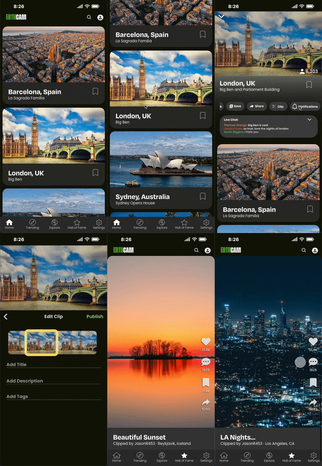
Many of the UI elements I focused on were creating were menu bars for the navigation, cards for the individual cameras to appear on through the home screen and trending pages, and camera pages and elements.
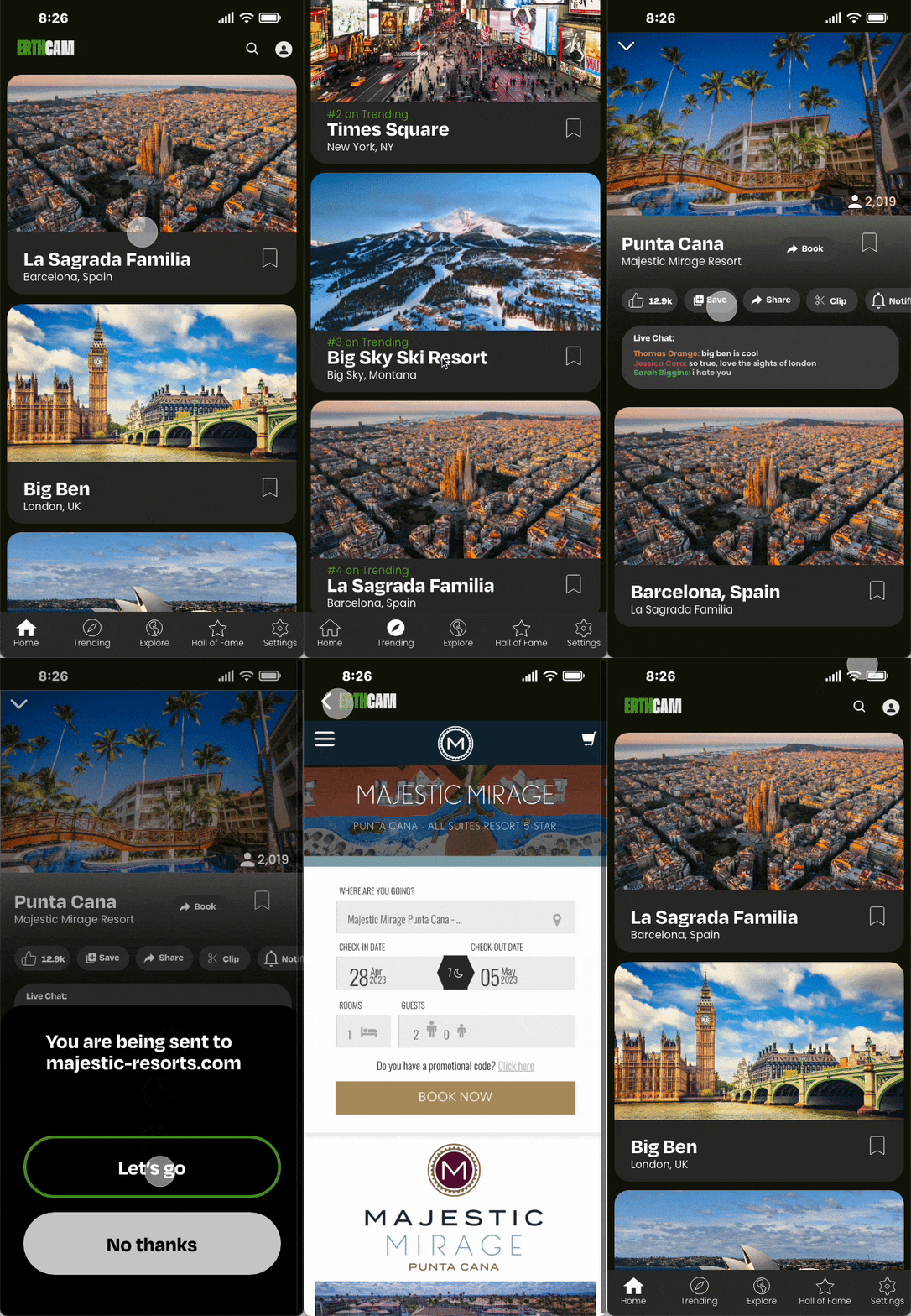
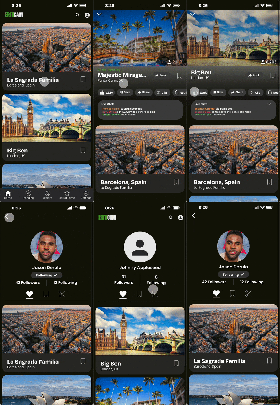
Once I had all these elements, I was finally able to build the screens themselves. For this, I wanted to incorporate as many features as possible (even if they weren’t usable) to make the app seem more feature rich from the surface.
Screens were some of the most interesting to build, as I was able to really add almost anything and design it however I wanted. Though, it also played to my downfall a bit as I constantly wanted to add more screens than were needed for my user flows, adding an explore feature that wasn’t used, and additional profiles that won’t be seen.
With my screens done, it was finally time to make my user flows. Being able to tie all these screens together proved to be more difficult than I imagined, requiring me to create a bunch more screens just so the flows didn’t feel janky.
Though, once done, it all came out pretty good!
Overall, I am pretty happy with how these came out, being one of my favorite projects that I was able to work on this past year. Making the prototypes and interactions and fleshed out and fluid as possible made it a fun challenge to try and see what could happen when a viewer clicks. It was great to see what my peers were doing as well, as it often gave me inspiration to add something new to my own flows. I hope to be able to do a project like this in the future!


