The Sins of Data Visualizations
Out of all of the forms of visual storytelling out there, one of the most damning that I've seen manipulated throughout the years has been data visualizations.
Data visualizations on paper are fantastic, as they communicate a vast amount of information in an easily accessible format that can be posted and shared, with IBM calling it "the representation of data through use of common graphics, such as charts, plots, infographics, and even animations" (IBM 2023).
Typical data is complex, an entire sheet of numbers showing no trends or other information.
Data visualizations solve all these problems. But when data is simplified, it can be manipulated by bad actors to present the information they want.
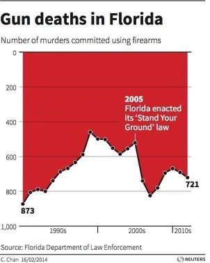
One of such is this one posted recently about gun deaths in Florida before and after their stand their ground law was passed back in the early 2000s.
It's presented to look like after the law, fewer deaths have occurred, but in fact, the opposite has happened. The y-axis has been flipped so that the numbers go from high to low, making 0 the top of the graph.
In reality, hundreds of more deaths were caused because of this law, something this graph tries to cover up.
And this isn't a one-off occurrence. It happens all the time.


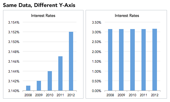
Graphs manipulate their data, change axis spacing, and more to show the conclusion they want to present.
And most people will believe it.
As people scroll through social media and news articles, they aren't clicking into the sources to investigate the data behind the graph; they inherently trust it at face value.
It's an issue that doesn't even have a clear solution, as readers need to realize how consistently manipulated the data is to see a trend.
Bernardita Calzon of Datapine discusses this in her article "Misleading Statistics Examples – Discover The Potential For Misuse of Statistics & Data In The Digital Age," saying how:
“While numbers don’t lie, they can in fact be used to mislead with half-truths. This is known as the ‘misuse of statistics.’ It is often assumed that the misuse of statistics is limited to those individuals or companies seeking to gain profit from distorting the truth, be it economics, education, or mass media.”
So, next time you are looking at a chart, take a closer look, as the author might be trying to drive you towards their conclusion.
Calzon, B. (2023, August 10). Misleading statistics – real life examples of Data Misuse. datapine. https://www.datapine.com/blog/misleading-statistics-and-data/
What is data visualization?. IBM. (n.d.). https://www.ibm.com/topics/data-visualization

